I’m reading the most fascinating book, The Nature Fix, by Florence Williams. I’ll fully review the book once I’ve finished it, but so far it’s wonderful. It’s different from other “get out into nature” books in that there is a lot of really interesting new science (or at least new to me) that I find completely enlightening and thought-provoking. There is the chapter on soundscapes, during which stress can be linked to a certain decibel common in big cities and near airports, then the chapter about fractals and their visual appeal to humans – even a section about art and how Jackson Pollock painted nature’s fractals twenty-five years ahead of their scientific discovery (p. 113)!
Also within this chapter, Box of Rain, is the discussion of fluent visual processing, our preferences for certain shapes and saturation, and the affect color has on our brains. This is nothing new; I remember learning, as a child, that warm colors like red and orange were more likely to excite and agitate, and that cool colors like blue and green had a relaxing effect. “The human eye is well designed to respond immediately to color,” writes Williams.
What I found so fascinating was that the reason we are so relaxed and calmed by green and blue is because we’ve learned to associate these colors with “life-giving, healthy ecosystems full of plants (green), clean water (blue) and expansive reflection (sky azures, ocean teals).” Williams continues, “Since we all live under that sky and drink its offerings, these hues may instill feelings of universality and shared humanity.”
I look around our house, at the deep blue dining room that we painted immediately upon moving in over 7 years ago, at the hosta-green room I’ve just repainted from green to a slightly deeper green, at the plants that I’m so drawn to, with new appreciation. It’s amazing how nature affects us, even when indoors.
I hope you’re having a wonderful Tuesday, the last day of February!

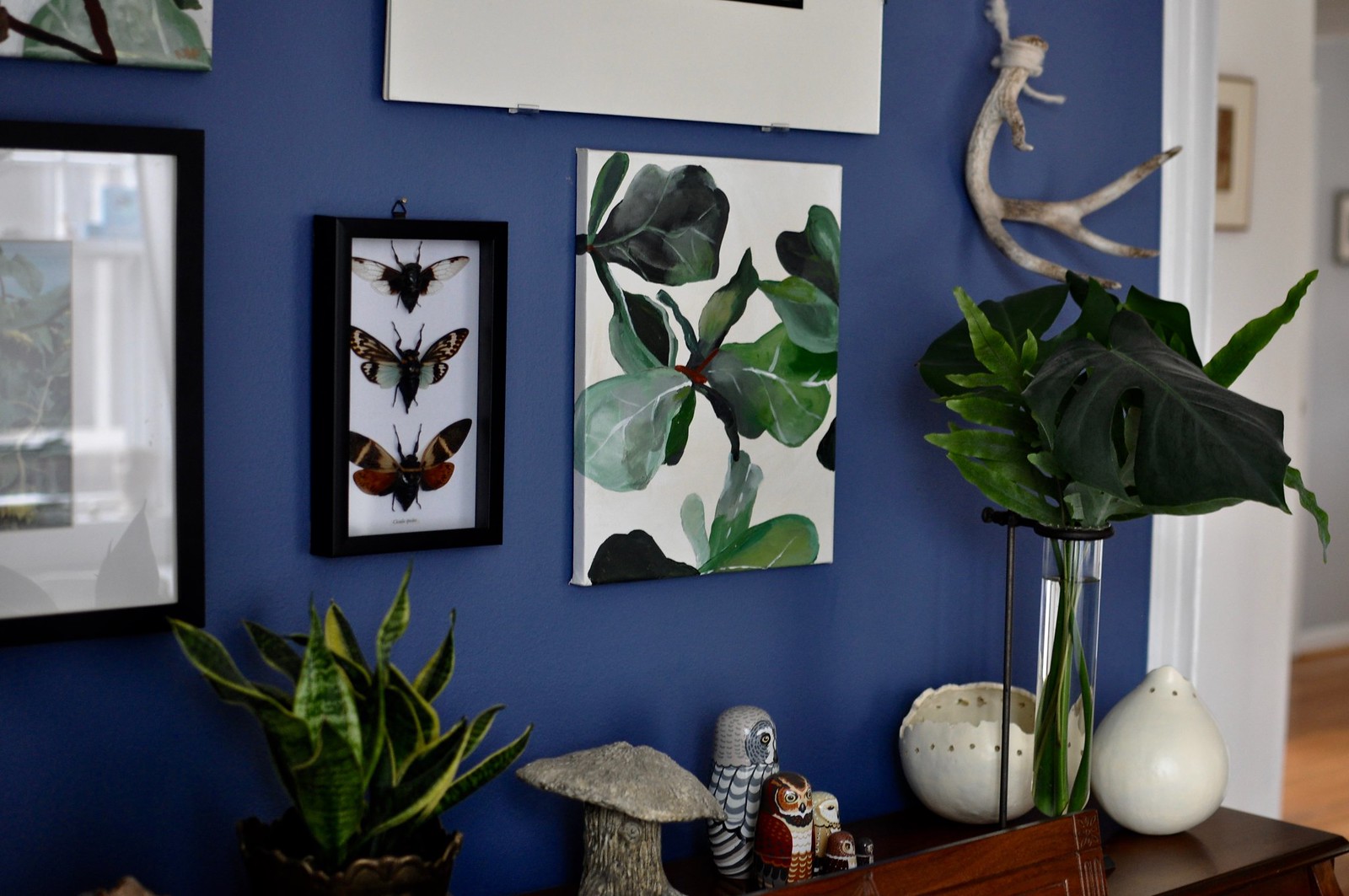
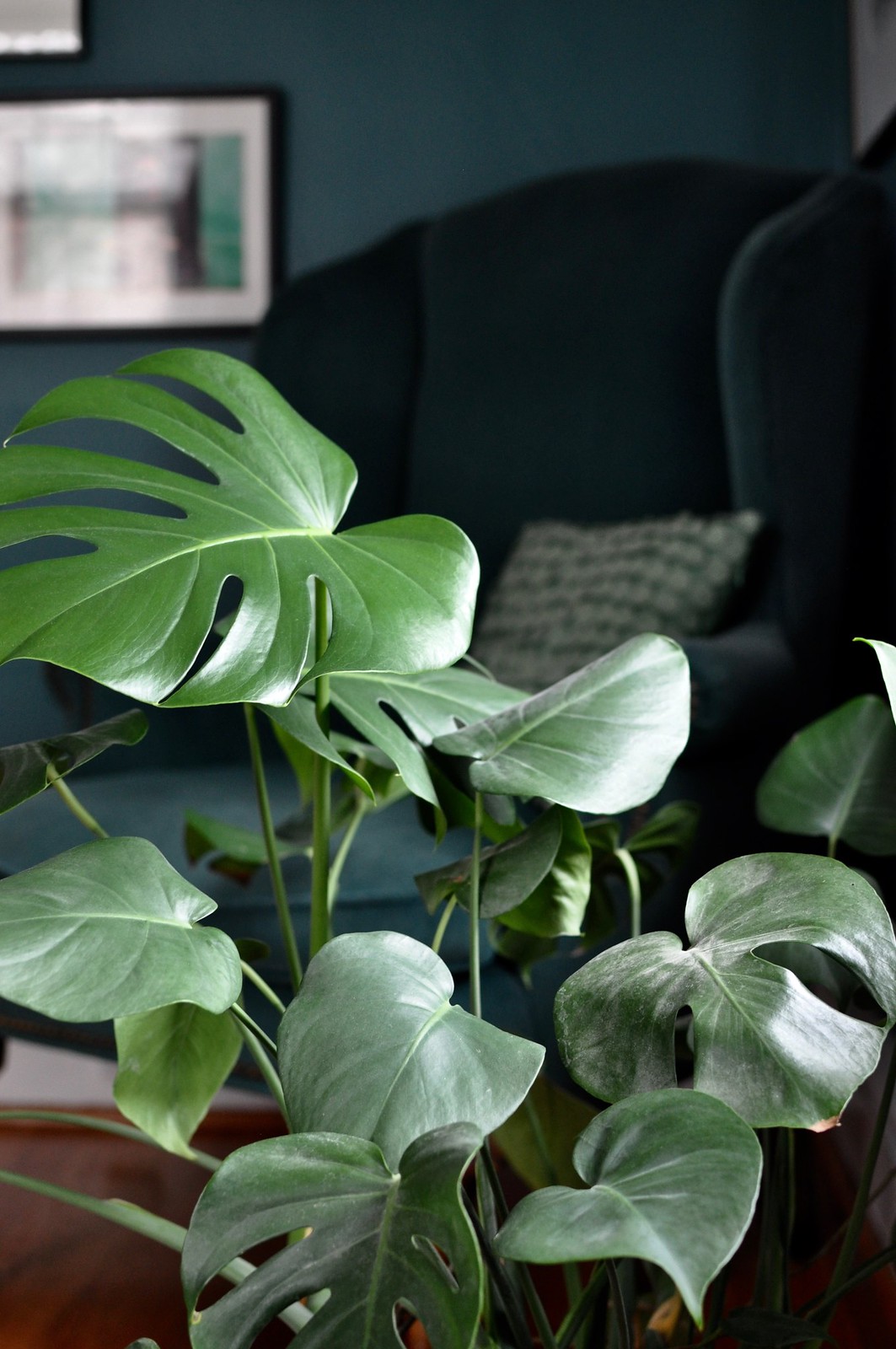
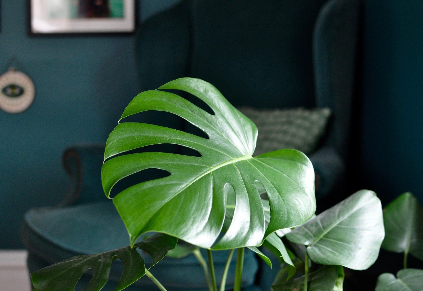
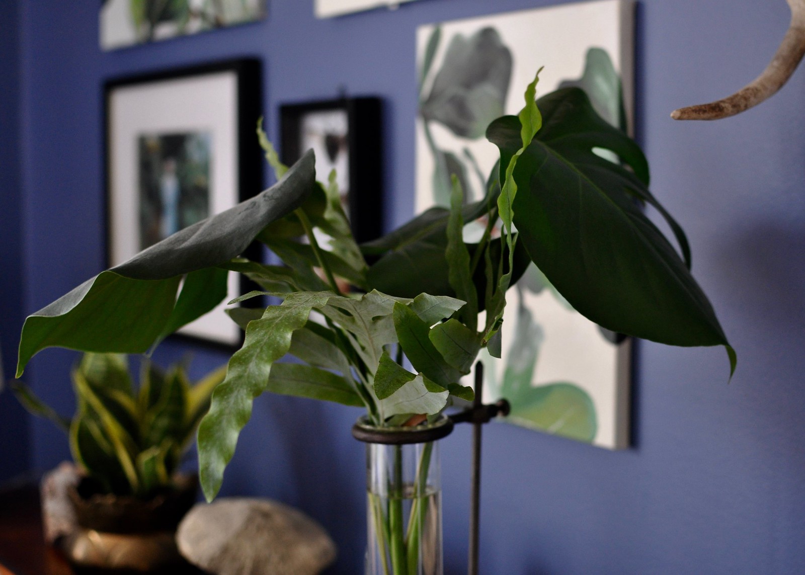
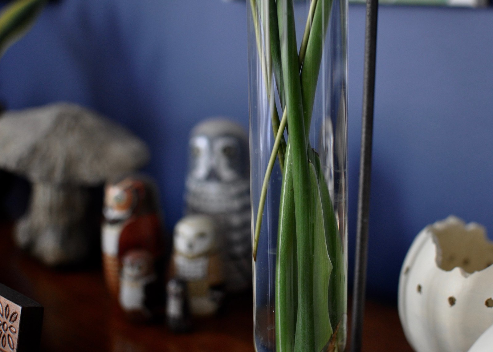
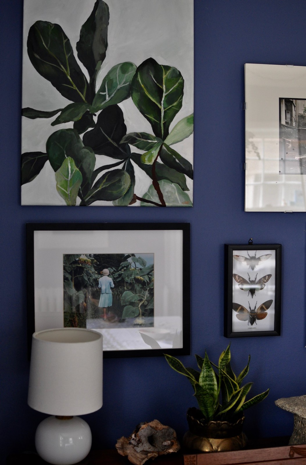
I love this Lauren! Our dining room is a very deep blue too and I find it so soothing. I initially just painted about the chair rail (mostly b/c I was lazy!) but just had it all painted blue, including the chair rail, and I love how dramatic it is. I also love the way the deep green looks with the navy. Where did you find those fiddle leaf paintings? Did you do them? I love them!
I saw pics on Instagram – I love the deep green color! And I found the paintings here:
https://www.etsy.com/shop/mollyalone?ref=l2-shopheader-name
Thank you so much Lauren for giving my paintings such a beautiful home :)! You have an amazing eye and I’m so flattered that you found a way to incorporate my work into your GORGEOUS dining room!
Thank you, Molly! I really love your plant work in particular; I hope you paint more of them!
Hi! Any chance that you can share what color and brand of paint you used in your dining room? We are painting in our house right now and this is the color I have been imagining! Thanks!
It’s an old Martha Stewart color called “Darkening Skies,” and I believe it has been discontinued. We are planning to repaint this room to touch it up, and the closest color I’ve found to the original is a Benjamin Moore color called “Prussian Blue.” It’s almost an exact match, only with a bit less of a purple tone. Hope that helps!
Very helpful, actually. When I showed your photos to my husband, he said, “Too purple.” Purple?!? We see things so differently.
AND we are using Benjamin Moore paint. I will get samples of the Prussian Blue and Admiral Blue, I think. Maybe Starry Night Blue, too, which sounds like “Darkening Skies.” Here’s to bringing new life to our rooms!
Thanks again!